To make a website look perfect is one of the most difficult tasks because it creates the image of a company in the minds of visitors. Once the concept is agreed, the design is developed and everyone is waiting for a stunning result, the standard look of a Google Map can spoil the picture. To avoid this, we suggest a couple of ways how to improve Google Maps design.
Map skins
These are layers that change the usual surface of a map. They are different in color, style, can highlight or omit some elements, etc. You don’t need to be a developer and a designer at once to add this option to your website. There is a popular resource Snazzymaps.com with plenty of skins. Just choose the one that suits best to the general design, copy its code and paste it on the page. With WP Map Pro plugin this process will take a couple of seconds. Find out more about it here.
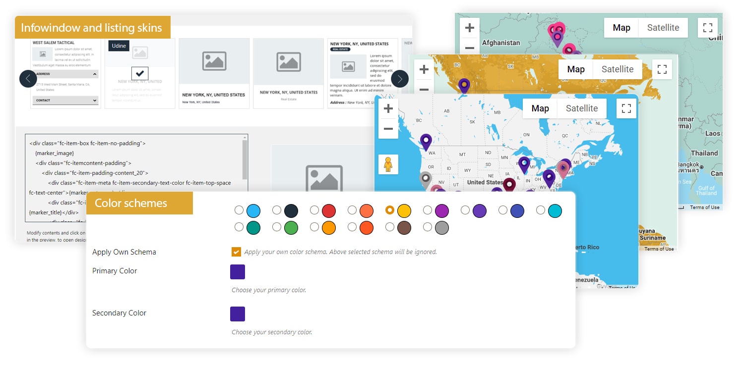
Color schemes
Skins change only Google Maps design. If you have additional elements like tables, fields, boxes or listings, they’ll stay the same by default. To make them align with the map, you need to apply another color scheme. Usually, it demands some changes in the code but our plugin helps even a basic user to do it easily.
You’ve probably heard that colors have meanings and send different messages to people’s subconscious. Below we have collected the key of them to use for Google Maps design:
- Red – associates with energy, wrath, passion and danger.
- Yellow – it reminds of the sun, light, summer and that’s why brings joy and happiness.
- Orange – expresses optimism, fun, creativity and energy.
- Green – the color of nature, health, peace and prosperity.
- Blue – says about stability, success, and trust.
- Purple – a symbol of royalty, and that’s why means luxury and high quality.
- Brown – best for agriculture and organic products, conveys simplicity and durability.
- Black – symbolizes seriosity, classic and death.
- Grey – represents conservatism and security.
More information on this topic you can find here.
Infowindow and listing skins
These are complementary elements, but they shouldn’t be different from the general Google Maps design. It’s not only about color. Infowindow skins, for example, have various structures. Some of them display pictures of objects, some contain extra fields like address and contact information, and there are types with descriptions only. Others don’t show text, only images and tags instead. You can explore and compare them following the link. Just scroll the page down and click on the examples with infowindow skins.
There are also several types of listings. The difference is in the elements every item has. Some skins display address while some contain tags. Categories can be placed either over the pictures or above titles. Some styles discolor images to black and white. Look at the live demos to see all the options.
The WP Map Pro plugin helps to implement all these ideas. You’ll be able to improve Google Maps design applying any kind of skins both for the map and its elements. The software also allows changing color schemes just in one click without dealing with the code. So, install it now!