Filter by Topics

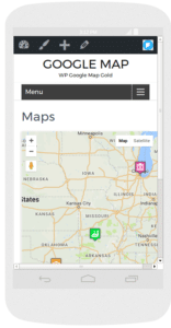
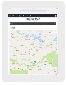
Want your maps to look perfect on every device? WP Maps Pro allows you to define screen-specific map settings — so you can set different width, height, and zoom levels for smartphones, tablets, and desktops. This helps you maintain usability and design consistency across all screen sizes.
🛠️ Steps to Apply Screen-Specific Settings
Step 1: Go to Add Map or Manage Maps in your WordPress dashboard.
Step 2: Scroll down to the Screens Specific Setting section.
Step 3: Enter your desired Width, Height, and Zoom Level for different devices such as mobile, tablet, or desktop.
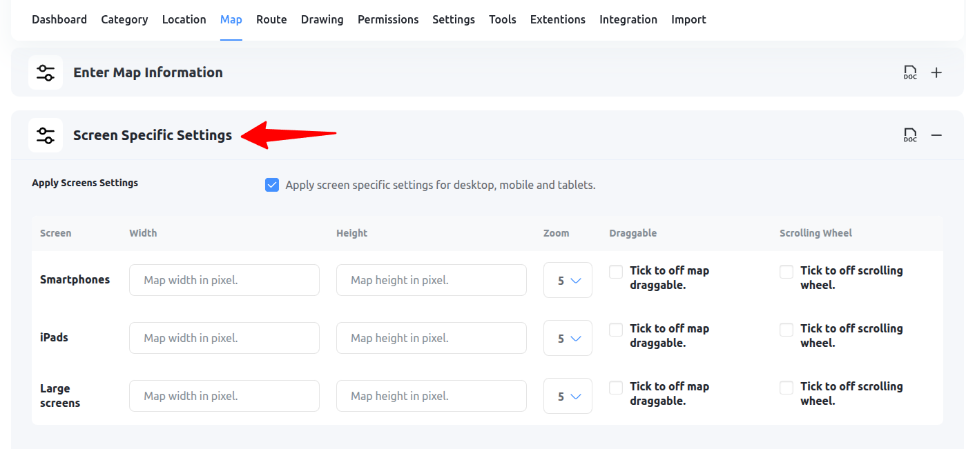
Step 4
Click Save Map and test it by viewing your site on different devices or screen resolutions.
💡 Why Use This Feature?
- Improve map readability on smaller screens
- Avoid scrollbars or broken layout on mobile
- Fine-tune user experience by optimizing zoom per device
Need help setting screen-specific values? Submit a support ticket — we’ll help you configure it right!