WP MAPS PRO - All-in-One WordPress Maps Plugin
Map Locations, Posts, Listings, and More with WP MAPS PRO, the top-rated WordPress Map Plugin trusted by over 200,000+ customers (4.51 rating). Build interactive maps and store locator finder using Google Maps or Leaflet—no coding needed.
Elite Author

200k+
Happy Customers
4.51
Average Rating
Why Choose WP MAPS PRO?
As an Elite Author product, WP MAPS PRO is the leading Google Map Plugin for map integration. Create scalable customizable maps for any site, from single stores to enterprise directories.

Powerful Store Locator
Add unlimited locations via CSV with automatic geocoding, plus search, filters, and directions.

Dynamic Content Mapping
Map posts, pages, or CPTs with geotags or ACF for real estate, events, or directories.

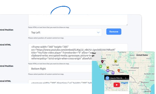
Highly Customizable
Use 25+ infowindow designs, custom markers, and Snazzy Maps skins for branded maps.

Scalable for Large Projects
Manage thousands of locations for franchises or directories with bulk imports and filtering.

Broad Compatibility
Works with Elementor, Divi, Gutenberg, Avada, Astra, and Contact Form 7 or Gravity Forms.

GDPR & SEO Optimized
Ensure privacy compliance and boost rankings with optimized map integration.
Perfect for Any Industry
WP MAPS PRO powers interactive maps for a wide range of use cases, making it the ultimate store locator plugin.

Retail & Franchises
Create store locators with directions and filters for multi-location businesses.

Real Estate
Map property listings with custom fields and stylish infowindows.

Events & Travel
Showcase event venues or travel destinations with dynamic mapping.

Directories
Build filterable directories for services, listings, or community resources.

Top Features at a Glance

Multiple Map Providers
Use Google Maps or Leaflet for cost-effective, GDPR-safe mapping.

Bulk Import Locations
Import thousands of locations via CSV with automatic geocoding.

Advanced Filtering
Filter by categories, taxonomies, or custom fields with radius searches.
Testimonial

sdfrick


“Actually I would give five stars to the product itself too. But the support puts it over the top. Compared to alternatives, this is the best investment for you money with the best support. I'm glad they're still making it work through the subscription economy. Great product for one price with great support. Just like the old days.”
webspacez
“This plugin is fantastic for displaying Google Maps with listings! It's easy to set up, highly customizable, and works flawlessly. The best part is the support—extremely fast, helpful, and handled with real care. We had a deep-lying issue with customizations, and without hesitation the plugin team jumped in to support us, and our problem was fixed! Highly recommended!”
itinnovationh
“WP MAPS PRO is incredibly flexible and easy to customize, making it perfect for a variety of mapping needs. The plugin's range of features allows for detailed personalization, which I really appreciate.
The support service is outstanding—quick, responsive, and always helpful. I’m very satisfied with both the product and the support. Highly recommended!”
support-it-deeda
“Excellent customer support and reactivity. We are using WP Maps Pro with Airtable to Google Maps extension to read in "real-time" the data in the tables. We've requested a small evolution to the team and it has been delivered very quickly at a fair price and was working at first time. Very efficient and professional services delivered by the team. Thank you !”


Solve Your Mapping Needs Today
From store locator for businesses to interactive maps for developers, WP MAPS PRO handles it all. Create filterable directories, show nearby amenities, or add multimedia infowindows with ease. With over 100 features, it’s the ultimate solution for any WordPress site.


Build Customizable Maps Now
Create interactive maps with WP MAPS PRO, the top Store Locator Plugin. Try free and unlock all features!